
Titanic catastrophe data analysis using Python
Data Extraction and Visualization project using Python:
In this project I will try to answer some basics questions related to the titanic tragedy using Python.
- Who were the passengers on the Titanic? (Ages,Gender,Class,..etc)
- What deck were the passengers on and how does that relate to their class?
- Where did the passengers come from?
- Who was alone and who was with family?
- What factors helped someone survive the sinking?
First we will get our dataset from Kaggle.com
After importing Python libraries such as Pandas, Numpy and seaborn we will open the dataset in Python and set it up as a Data Frame:
import pandas as pd
import numpy as np
from pandas import Series, DataFrame
from scipy import stats
import matplotlib as mpl
import matplotlib.pyplot as plt
import seaborn as sns
%matplotlib inline
titanic_df = pd.read_csv(r"C:\Users\Usuario\Desktop\Titanic Project\data.csv")
Let’s take a look for our data:
titanic_df.head()
| PassengerId | Survived | Pclass | Name | Sex | Age | SibSp | Parch | Ticket | Fare | Cabin | Embarked | |
|---|---|---|---|---|---|---|---|---|---|---|---|---|
| 0 | 1 | 0 | 3 | Braund, Mr. Owen Harris | male | 22.0 | 1 | 0 | A/5 21171 | 7.2500 | NaN | S |
| 1 | 2 | 1 | 1 | Cumings, Mrs. John Bradley (Florence Briggs Th... | female | 38.0 | 1 | 0 | PC 17599 | 71.2833 | C85 | C |
| 2 | 3 | 1 | 3 | Heikkinen, Miss. Laina | female | 26.0 | 0 | 0 | STON/O2. 3101282 | 7.9250 | NaN | S |
| 3 | 4 | 1 | 1 | Futrelle, Mrs. Jacques Heath (Lily May Peel) | female | 35.0 | 1 | 0 | 113803 | 53.1000 | C123 | S |
| 4 | 5 | 0 | 3 | Allen, Mr. William Henry | male | 35.0 | 0 | 0 | 373450 | 8.0500 | NaN | S |
After taking a look for our data set, in a way to answer the first questions, we can notice that the column Sex is divided to two genders, Man and Women. But for better analyzing we will add another gender (Child) asuming that every person is under 16 years old is a child.
def male_female_child(passenger):
    # Take the Age and Sex
    age,sex = passenger
    # Compare the age, otherwise leave the sex
    if age < 16:
        return 'child'
    else:
        return sex
# We'll define a new column called 'person', remember to specify axis=1 for columns and not index
titanic_df['person'] = titanic_df[['Age','Sex']].apply(male_female_child,axis=1)
Now after we created another column called person, let’s visualize our data.
sns.catplot("person",data=titanic_df,kind="count")
titanic_df["person"].value_counts()
male      537
female    271
child      83
Name: person, dtype: int64
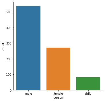
As we can see there were on the Titanic:
537 males 271 females 83 Children
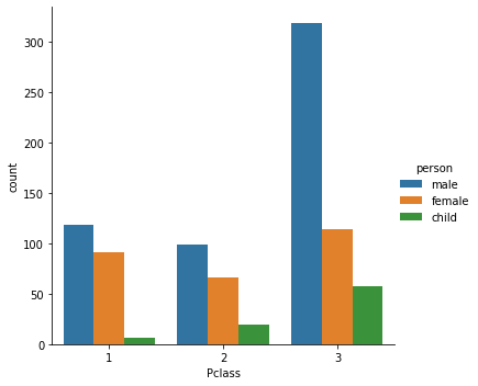
Now let’s see how they were distributed in their classes.
sns.catplot("Pclass",data=titanic_df,hue="person",kind="count")
<seaborn.axisgrid.FacetGrid at 0x2007b537948>
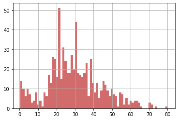
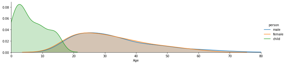
Now let’s get more precise picture of the normal distubiotion of the passengers age on the Titanc:
titanic_df['Age'].hist(bins=70,color='indianred',alpha=0.9)
Another way to visualize the data is to use FacetGrid to plot multiple kedplots on one plot
fig = sns.FacetGrid(titanic_df, hue="person",aspect=4)
fig.map(sns.kdeplot,'Age',shade= True)
oldest = titanic_df['Age'].max()
fig.set(xlim=(0,oldest))
fig.add_legend()
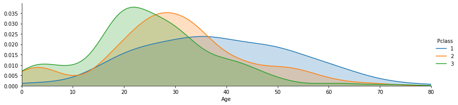
Let’s do the same for class by changing the hue argument:
fig = sns.FacetGrid(titanic_df, hue="Pclass",aspect=4)
fig.map(sns.kdeplot,'Age',shade= True)
oldest = titanic_df['Age'].max()
fig.set(xlim=(0,oldest))
fig.add_legend()
We’ve gotten a pretty good picture of who the passengers were based on Sex, Age, and Class. So let’s move on to our 2nd question: What deck were the passengers on and how does that relate to their class?
If we look back to our dataset, specially to a Cabin column, first we have to drop all the null values and creat a new object called deck.
deck=titanic_df["Cabin"].dropna()
We only need the first letter of the deck column to classify its level, in order to do this we will create an empty list and loop it to grab the first letter.
# Set empty list
levels = []

# Loop to grab first letter
for level in deck:
    levels.append(level[0])

# Reset DataFrame and use factor plot
cabin_df = DataFrame(levels)
cabin_df.columns = ['Cabin']
sns.catplot('Cabin',data=cabin_df,palette='winter_d',kind="count")
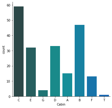
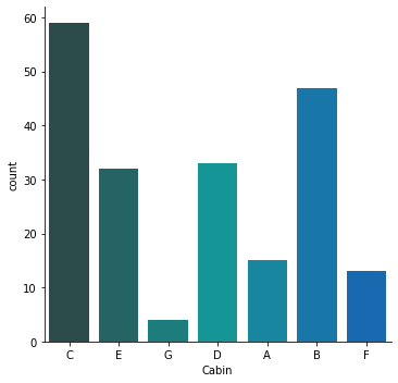
nteresting to note we have a ‘T’ deck value there which doesn’t make sense, we can drop it out with the following code:
cabin_df = cabin_df[cabin_df.Cabin != 'T']
#Replot
sns.catplot('Cabin',data=cabin_df,palette='winter_d',kind="count")
now that we’ve analyzed the distribution by decks, let’s go ahead and answer our third question:
3.) Where did the passengers come from?
Note here that the Embarked column has C,Q,and S values. Reading about the project on Kaggle you’ll note that these stand for Cherbourg, Queenstown, Southhampton.
sns.catplot('Embarked',data=titanic_df,hue='Pclass',order=['C','Q','S'],kind="count")
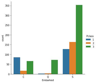
An interesting find here is that in Queenstown, almost all the passengers that boarded there were 3rd class. It would be intersting to look at the economics of that town in that time period for further investigation.
Now let’s take a look at the 4th question:
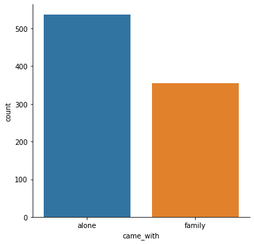
4.) Who was alone and who was with family?
Let’s start by adding a new column to define alone
We’ll add the parent/child column with the sibsp column
titanic_df['Alone'] = titanic_df.Parch + titanic_df.SibSp
Now we know that if the Alone column is anything but 0, then the passenger had family aboard and wasn’t alone. So let’s change the column now so that if the value is greater than 0, we know the passenger was with his/her family, otherwise they were alone.
titanic_df.head()
| PassengerId | Survived | Pclass | Name | Sex | Age | SibSp | Parch | Ticket | Fare | Cabin | Embarked | person | Alone | |
|---|---|---|---|---|---|---|---|---|---|---|---|---|---|---|
| 0 | 1 | 0 | 3 | Braund, Mr. Owen Harris | male | 22.0 | 1 | 0 | A/5 21171 | 7.2500 | NaN | S | male | With Family |
| 1 | 2 | 1 | 1 | Cumings, Mrs. John Bradley (Florence Briggs Th... | female | 38.0 | 1 | 0 | PC 17599 | 71.2833 | C85 | C | female | With Family |
| 2 | 3 | 1 | 3 | Heikkinen, Miss. Laina | female | 26.0 | 0 | 0 | STON/O2. 3101282 | 7.9250 | NaN | S | female | Alone |
| 3 | 4 | 1 | 1 | Futrelle, Mrs. Jacques Heath (Lily May Peel) | female | 35.0 | 1 | 0 | 113803 | 53.1000 | C123 | S | female | With Family |
| 4 | 5 | 0 | 3 | Allen, Mr. William Henry | male | 35.0 | 0 | 0 | 373450 | 8.0500 | NaN | S | male | Alone |
def alone(passenger):
    sib,parch = passenger
    if sib ==0 and parch==0:
        return "alone"
    else:
        return "family"
titanic_df['came_with'] = titanic_df[["SibSp","Parch"]].apply(alone,axis=1)
sns.catplot('came_with',data=titanic_df,kind='count',order=(["alone","family"]))
Great work! Now that we’ve throughly analyzed the data let’s go ahead and take a look at the most interesting (and open-ended) question: What factors helped someone survive the sinking?
# Let's start by creating a new column for legibility purposes through mapping (Lec 36)
titanic_df["Survivor"] = titanic_df.Survived.map({0: "no", 1: "yes"})

# Let's just get a quick overall view of survied vs died.
sns.catplot('Survivor',data=titanic_df,palette='Set1',kind="count")
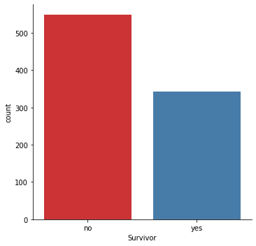
So quite a few more people died than those who survived. Let’s see if the class of the passengers had an effect on their survival rate, since the movie Titanic popularized the notion that the 3rd class passengers did not do as well as their 1st and 2nd class counterparts.
# Let's use a factor plot again, but now considering class
sns.catplot('Pclass','Survived',data=titanic_df,kind="point")
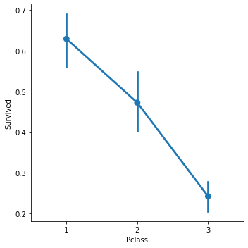
Look like survival rates for the 3rd class are substantially lower! But maybe this effect is being caused by the large amount of men in the 3rd class in combination with the women and children first policy. Let’s use ‘hue’ to get a clearer picture on this.
# Let's use a factor plot again, but now considering class and gender
sns.catplot('Pclass','Survived',hue='person',data=titanic_df,kind="point")
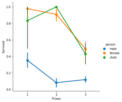
From this data it looks like being a male or being in 3rd class were both not favourable for survival. Even regardless of class the result of being a male in any class dramatically decreases your chances of survival.
But what about age? Did being younger or older have an effect on survival rate?
# Let's use a linear plot on age versus survival
sns.lmplot('Age','Survived',data=titanic_df)
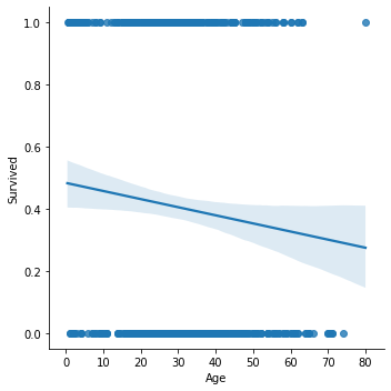
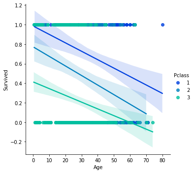
Looks like there is a general trend that the older the passenger was, the less likely they survived. Let’s go ahead and use hue to take a look at the effect of class and age.
# Let's use a linear plot on age versus survival using hue for class seperation
sns.lmplot('Age','Survived',hue='Pclass',data=titanic_df,palette='winter')
We can also use the x_bin argument to clean up this figure and grab the data and bin it by age with a std attached!
# Let's use a linear plot on age versus survival using hue for class seperation
generations=[10,20,40,60,80]
sns.lmplot('Age','Survived',hue='Pclass',data=titanic_df,palette='winter',x_bins=generations)
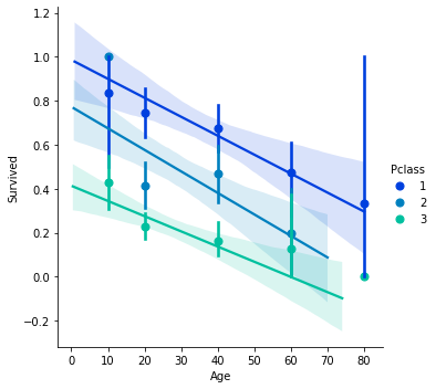
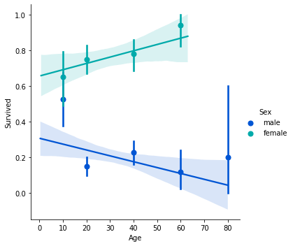
Interesting find on the older 1st class passengers! What about if we relate gender and age with the survival set?
sns.lmplot('Age','Survived',hue='Sex',data=titanic_df,palette='winter',x_bins=generations)